American Apparel poster – Feminist and beauty in advertisement

Last November, American Apparel closed all the stores in Australia. The brand, which is known of sexual advertisement, announced bankruptcy at last.

Young girls and tempting expression, they are two key elements in their poster and advertisements. Such as this one below, the woman in the poster lying on the ground and spread her legs, looking at the audience directly. The words “Now open” stays in the right top corner. So what exactly is “open”?
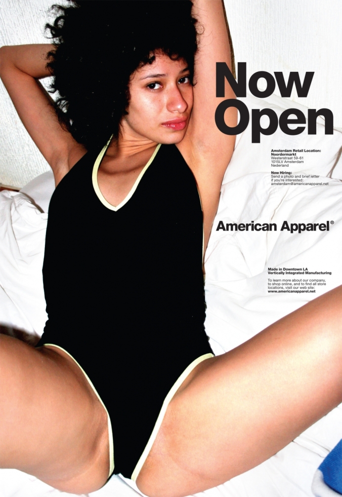
american-apparel-ad-amsterdam-nowopen-06-2.jpg

Image 1 Now open

As a clothing brand, American Apparel focuses on human figure more then their clothes. Their designs are based on the 80th American pop culture. Honestly, their clothing are not that unique, even you can find similar product in any store on the street. But people will still buy their products. Should beauty be sexualized? Or should women play the roll of sexual to grab attention?

Cheryl Buckley mentioned: “Advertising serves to enforce the meaning of design as defined by the designer or manufacturer.”[1] In American Apparel’s advertisement, women are just like objects to attract the audience. They are natural, instead of hiring skinny and pretty young girls, the models are just like everyone else around us. “Advertising creates both ideal use for product and ideal user.”[2] In this advertisement below, the model is even half naked on the left poster. And on the right panel, the model lies on the bed, seems waiting someone. Words “School’s out” are right beside it. What does the poster try to express? The human figure or clothing? Beauty does not equal to sexual behavior.

american-apparel-advertising-1

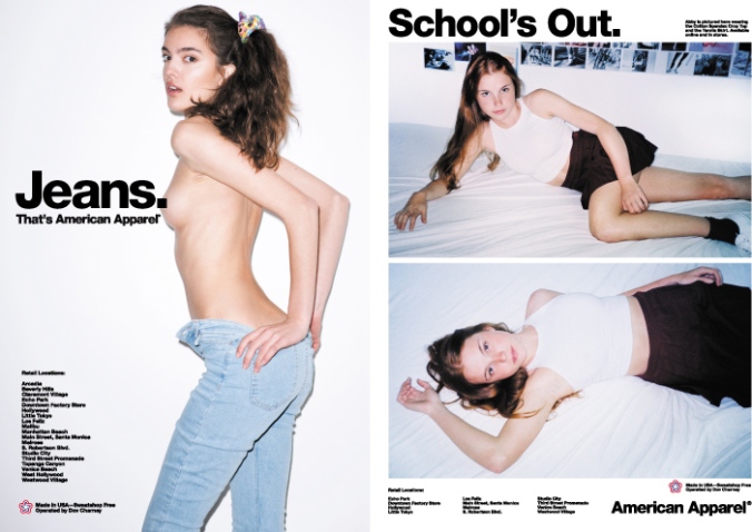
Image 2 Jeans and School’s out

We cannot say the poster is a bad design. “Exclusive definitions of good and bad design are constructed, based almost entirely on esthetics. These definitions serve to isolate design products from material and ideological conditions of production and consumption”[3], said Cheryl Buckley. But female shouldn’t be defined as sex tools and relying on male. Although American Apparel declared that they are just using natural body to advertise, they are still be considered that trying to use sexualized poster to attract their customer, and it won’t last long. Some country even banned their advertisement for they think it will cause negative infection to their society. In contemporary society, women are not objects to show or grab attention, and sexual poster and advertisements will no longer be useful to attract customers. Designs should base on proper esthetic according to the contemporary society.

[1] Cheryl Buckley, ‘Made in Patriarchy: Toward a Feminist Analysis of Women and Design,’ in Design Discourse: History/Theory/Criticism, ed. Victor Margolin. Chicago and London: The University of Chicago Press, 1989, 251-62.

[2] ibid

[3] ibid

Out of sight – Exhibition review

EXHI041128

During February 10th to April 17th, Out of sight was exhibited in NGV. It is a hopscotch-inspired artwork created by American conceptual artist Lawrence Weiner. According to the artist, it is a journey of creative self-reflection. The whole work is divided into 7 parts; all of them are text based.

Beside it, there are some videos that enable the viewers to understand the project more. According to Weiner’s work, the video records several teenagers between 12 to 18, sharing their ideas about their life and future.

Lawrence Weiner is known of works which playing with languages. Sculptress, walls, public spaces… He left his works all over the places. This time, he places them on the ground, like hopscotch. This invites viewers to participate the progress themselves. On the very beginning, there is a paragraph said: “Walk on this work of art and take part in a journey of create self-reflection”.

Walking along the work, people start their self reflection.

The first and the second part is “assuming a position”, and “presume a destination”. It asks people to think about their current situation and think about their possibilities in future. The third and the forth part is “one can only image the powers that be” and “imagined things can be altered to suit”. In my interpretation, it may encourage people to seek their potential powers at the future. The last to part says: “Spit into the wind, hope for the best”, and “the destination is straight on”. In the end, Weiner gives the best wishes to those people who are achieving their goals.

The whole work is filled with words and grids in black and white as Weiner’s work used to be. Interesting thing is, these simple phrases can be intercepted differently according to every single person. In Weiner’s perspective, space and language are parts of the artwork. The message from the artwork varies from people to people. “No one, not even the least privileged among us, is ever entirely powerless over the messages that traverse and position him at the post of sender, addressee, or referent”, Jean-Francois argued. The artwork itself is like a mirror; each of us will reflect messages according to ourselves. Speaking of his language’s visual and spatial qualities, he actually has his own intention in his works. For most works were composed with words, language can express more things. He tried to use language and concept to provide a sufficient foundation for his presentation, at the mean time, it will attract viewers’ attention to what the form itself. Like Jean-Francois said: “It immediately positions the person who asks, as well as the addressee and the referent asked about: it’s already the social bond.” As a showpiece in the gallery, it will successfully engage the viewers to participate themselves into the artwork. Plus, Weiner always keeps everything simple and clear. There are only few lines and some phrases, no color and more images to disturb viewer’s attention.

http://www.ngv.vic.gov.au/exhibition/lawrence-weiner-outofsight/

Lyotard, Jean-François ‘The Postmodern Condition: A Report on Knowledge,’ in The Postmodern Condition, Manchester: Manchester University Press, `1984.